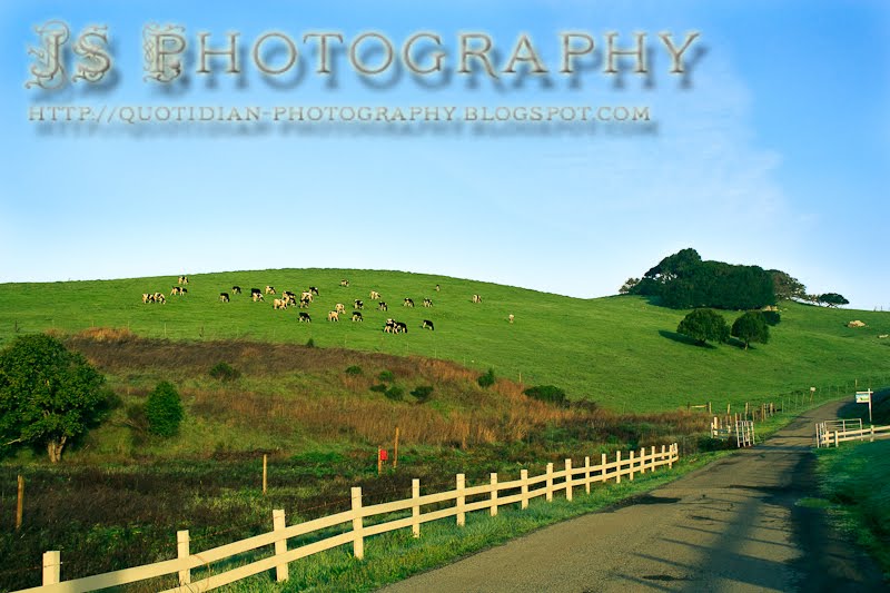
As you can probably tell, I'm working on finding a watermark that works for me. I'm still not wild about this one, although I do like the font. I'd like it to be really legible, but also elegant and unobtrusive. A tall order, in other words.
Let me know what you think.


I really like the shadowing behind the watermark...it is easy to read, but the intricate details around the JS P - makes it a bit difficult (for my blind eyes anyways) - is there a way you could lighten that a bit?
ReplyDeleteAs for the cows, I love this scene, so relaxing! I feel like I could be walking down that road and up around the curve...
I would make the water mark as light as possible for minimal interference with the image. If the image is liked enough people will work out the watermark - or how about a small box in the corner? For me the watermark as you currently have it is a wee bit distracting.
ReplyDeleteTea bags are in the post, should land with you soon!
I, like already said, think it is a little too large. I like your picture and the angle you shot it from (diagonal lines).
ReplyDeleteI think it depends on what your reason for the watermark is.
ReplyDeleteIs it only so that people will be able to find you when they see your photo elsewhere than on your site, or is it meant as a deterrent for illegal copying? If the latter, then large and big is good, but if only the former, I'd go for a small but legible text in a corner. Or even outside the image.
Some examples:
As a deterrent: http://www.drumimages.co.uk/mammals/brownhare.html
Findable photographer:
http://www.vanilladays.com/
Clear message, but outside the photo:
http://gazzajagman.deviantart.com/art/Inside-the-Oracle-40910310
Obviously, the latter option is very easy for anyone to cut off and re-use the image without giving you credit.
I like the cows...
ReplyDeleteNNMNM
I like your picture a lot. Love cows, they are so interesting and colorful. I have also been trying to find a watermark. I haven't found what I want yet, so I have my name come up in my EXIF data from mu camera.Now that might not keep them from taking my picture but it would help me to get it back if there was a lawsuit or something.
ReplyDeleteI think the points that Els makes are very relevant. If you've noticed I keep mine quite small and down in the corner. I usually have the opacity set down around 50% or even less. I also have the copyright data in the EXIF. I think secretly I'd be flattered if someone thought it was good enough to steal and use, though I might try to get paid for it if they did ;) .
ReplyDeleteTo be totally honest I would rather look at your beautiful images than your huge watermark, no matter how fancy or dressy it may be, but that's just me.
Once again, great morning light with a great natural gradient in the sky. You have great variety between urban and rural photos.
ReplyDeleteIf you are going to do a watermark, the quality of your work deserves an awesome one! I find the current one really distracting, I think because it is very busy. The drop shadow makes it very complicated to look at - not a clean look at all. I so love the fancy font, but think that having the first P in photography like that is kind of confusing. You might consider doing JS in the fancy font, and then making the typesize for the word photography about half the size and without the fancy P. Maybe even use a script font for Photography. I'll be interested in seeing how it evolves as time goes on...
ReplyDeleteI think it is what you are trying to achieve...giving a stealth napper a hard time trying to get rid of all those shadows that are too far from the text? Or is it just recognition of your mark where ever the image travels?
ReplyDeleteI always fall back on the statement: Just because you can do something doesn't mean that you should do something... I ran across this statement in newsletter editing where people used many fancy fonts and complicated effects...all on one page. It is distracting.
My first suggestion is to tighten the shadow closer to the text. I like the lighter color you are using, which doesn't conflict with the image. I am not sure about the initial fonts with the extra detail on them. Maybe if you were just using the initials???
Keep trying until you come up with something you are happy with!
I'm glad you changed the mark from this and as has been said it depends what you want your mark to do. This photo is what I think of the Bay Area looking like many years ago. Seems like there should be poppies.
ReplyDelete