I'm so glad you found me! I'm a San Francisco photographer, and this blog charts my journey in the ever-evolving world of photography. One of the things I love about photography is that it's a journey, not a destination. I'm constantly learning and meeting wonderful people. Please peruse the blog to your heart's content, then check out my website and feel free to contact me! (I love hearing from you.)

“Which of my photographs is my favorite? The one I’m going to take tomorrow." – Imogen Cunningham

“A portrait is not made in the camera but on either side of it.” – Edward Steichen

Droplets

This photo reminds me of the green I like. Hmmm, wonder if I should add peach too?


So, I know you guys are all waiting to hear about my upcoming nuptials and what we're planning.

Well, BIG NEWS! I have (kind of, maybe) decided on a color theme. Once we chose the venue, it seemed a little clearer. The colors are: grass green, sage blue, lavender, camel/latte, and maybe gray. I think choosing camel and gray is a little cray-cray, historically they are neutrals you're not supposed to mix, and I may end up ditching the gray, but we'll see. (Also, not everything at the wedding will be in this color scheme, I am not that fussed, but playing with color makes me happy.)

I guess my only question to you is, do you think that I should keep the blue and the lavender, or just stick to one of them? The main colors to my mind are the green and camel. All the others are just accent colors. I've been reading The Perfect Palette a bit lately (great fun if you're addicted to color combinations) and I like her palettes, but this one just feels like me.

But then, you know, I feel like adding yellow, and that doesn't go with any of the existing colors . . . gah! Fortunately, there's no big hurry. So, what do you think?

I can't stop listening to . . .

Unrelated photo. I've been messing with the 17mm t/s lately, trying to use it to the full extent of its capabilities. This is one of my favorite places, Sutro Baths.

Elenowen's Pulling Back The Veil. Gorgeous, stripped-down harmonies, and well sung too. A great chill album.

Panic! At the Disco's Vices and Virtues. Almost a polar opposite, it's upbeat, catchy, and I can't stop singing along. I think they might be an acquired taste, but I love everything they've done. And I also love frustratingly the unreleased track Kaleidoscope Eyes (theme song for the apartment, Barrie? Maybe, maybe not).

In other news, some of my Lensbaby images are up on their site. Just go here, and then look at either the pinhole or the Sweet 35 optic in the optic drop-down menu. In total, three of my images are up. Nothing major, but still fun and exciting!

Cable Car Pan


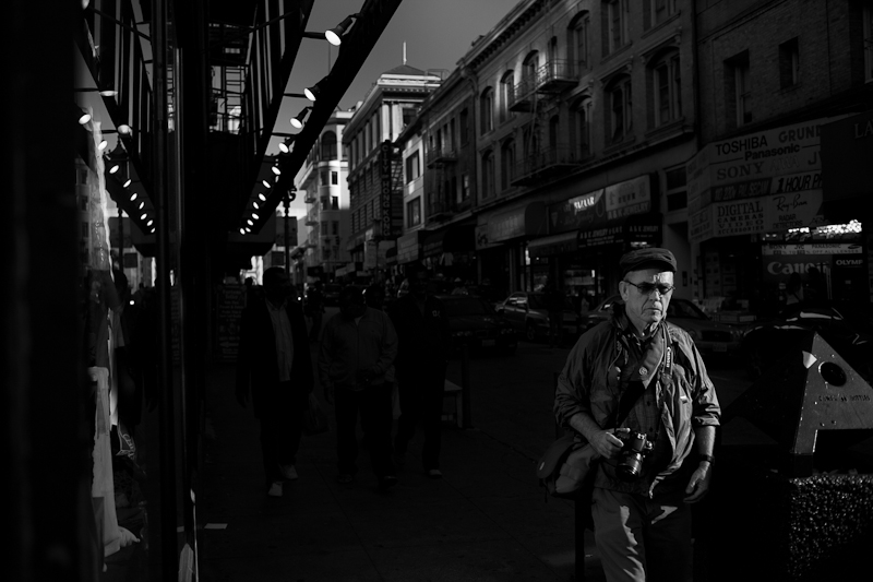
Mouseover Monday 9 - The Photographer


Mouse over to see the image in color.  

I've been watching David duChemin on CreativeLive (a class I bought a while ago and hadn't watched yet - yes, I'm behind), and one of the things he said about quality of light really stuck with me. I admit I like softer light most of the time, especially for portraits. But he mentioned one way of dealing with super contrasty light that I haven't used much (mostly because I just avoid shooting it at all).

The method he espoused is exposing for the highlights and letting the rest fall into deep shadow. Especially if you have a small highlight area this can be very effective and dramatic. So while on a photowalk last week (courtesy of the now-defunct Adobe pop-up store) I decided to implement the strategy.

I found a slice of light, positioned myself and waited for someone to walk through it. It just happened to be this other photographer from the photowalk who came through the light first. And I actually like the hard light on his technical clothing and photography equipment - it feels appropriate.

Don't forget to mouse over the picture to see it in color. I like it in color too, but I like the feel of the black and white better.

Also, do you ever have trouble finishing projects? This article might help.

And these are the best 1 minute videos I've ever seen. You must watch all three.

Purple


 . . . for Melanie.

Mandy and Tony, San Francisco Engagement Photographer

Mandy and Tony are special. And I kind of knew that from the first moment I saw them together. They balance each other out, and there's a quiet give and take that's a real pleasure to watch. We met at the Rose Garden in Golden Gate Park last week. As I may have previously mentioned, San Francisco summer evening weather was out in full force, so it was just a tad cold, but Mandy and Tony didn't complain. In fact, I think I probably complained more than either of them, and I didn't have to wear a dress.

Plus, did I mention that Mandy's a fabulous baker and you can get some of that deliciousness whenever you want? I highly recommend the churro cupcakes. That is all you need to know.


The roses are particularly fine this time of year.

They also brought the third member of their family with them, Oscar. He was a total picture champ, as you'll see.


The two of you are so cute together. It's beautiful to watch.


I know I posted this photo before, but I'm just in love with it.


This one is another favorite. Oscar, if I ever need a dog model, I will definitely give you a call!


Gorgeous. Were we lucky with the light or what?


They brought along a hat to keep Mandy's hair contained. (The San Francisco wind never sleeps.) Apparently the hat was originally Tony's but Mandy stole it. And I can see why. It's the perfect color to go with her dress.


Then again, Tony looks pretty fierce in it too.


We walked over by the de Young and found this great wild pool area. Oscar wanted to jump in and eat the water lilies or something, but we made him pose instead.


I really can't decide. I think this series looks fabulous in color or in black and white.


We finished off the shoot with a trip to some of the columns.


Tony, Mandy, thank you so much for being amazing on the shoot. Your wedding and the rest of your lives together will be something to watch. Oh, and your cupcakes are bomb, too.