One of my 'anonymous commenters' (actually not anonymous really, as I know who he is, and appreciate his comments very much) mentioned that the snow was a bit blue in the Vista photo yesterday.
Well, actually, the whole photo was a bit blue. I decided to show you two possible ways of addressing this problem only using Lightroom.
The first photo I adjusted globally, making the whole photo more yellow, and more color corrected. This is a smaller version, but you can click on it to make it bigger.
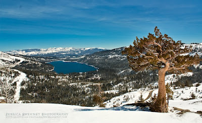
You can see that the sky isn't as blue, nor is the lake or the mountains. Everything got a little bit yellower. In general, this is the way I color correct my images. I try to have them pretty close to color neutral. Now, the photo yesterday I didn't mind the blue look, as it made the photo seem a little colder, a feeling that I was going for.
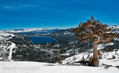
The second option for getting rid of the blue snow was just to desaturate the snow. I did that with the adjustment brush in Lightroom, and you can see the effect in the image below. I was feeling lazy, so I only desaturated the snow in the foreground, but I think you can get the idea.
So, of the three versions of the image, which do you prefer? Or do you care? How important is color management to you? Sound off in the comments. I have an idea which one I like best, but I'd like to hear your reactions first.


